Omeda Studios / 2024 – 2025
Whilst working with Omeda Studios, I was Principal UI/UX Designer as part of their UI/UX team. Working alongside the Head of UI/UX, I acted as the most senior individual contributor on the team, mentoring and guiding others on the team to deliver high quality work for the free to play MOBA Predecessor. Individually, I led UI/UX design on multiple features, with the standout being Loot Cores, and Reward UI. I also implemented quality of life UI improvements to HUD UI, and produced the Hero Art for multiple heroes, and ability icons for the hero Boris.
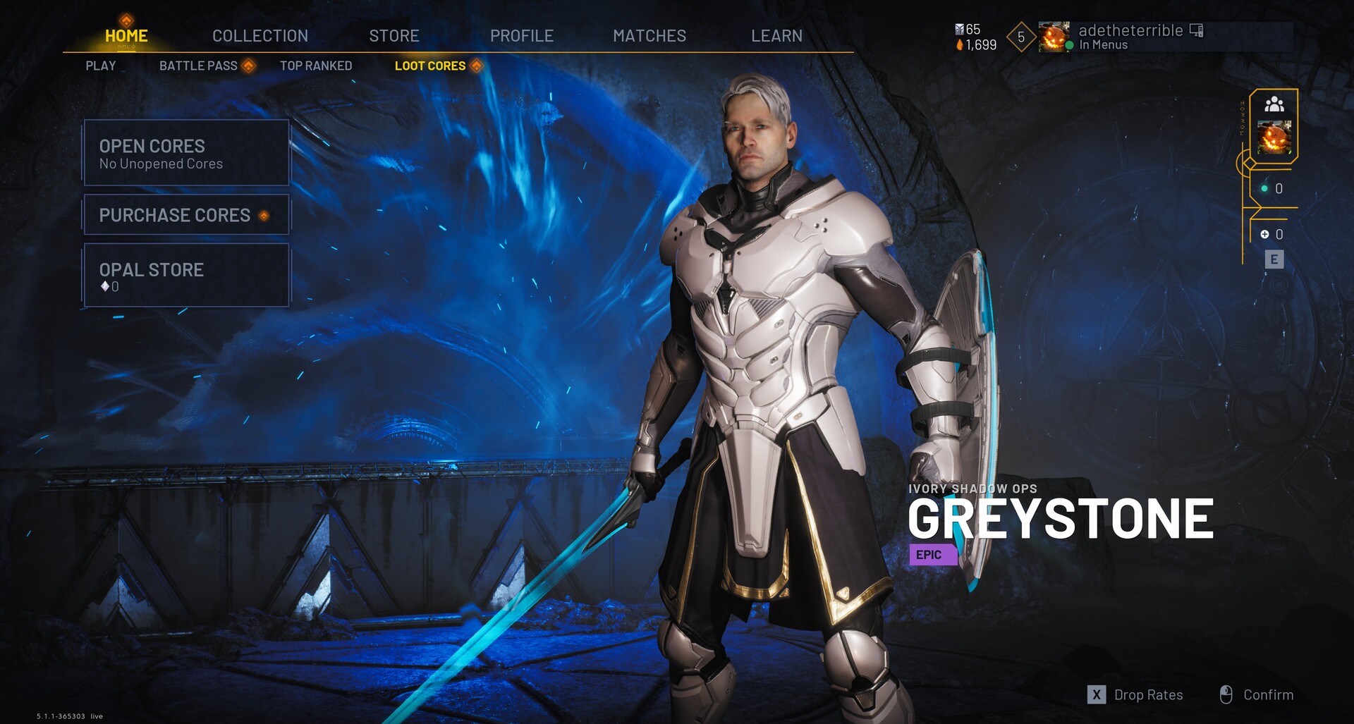
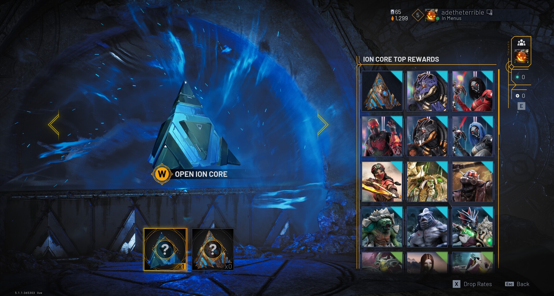
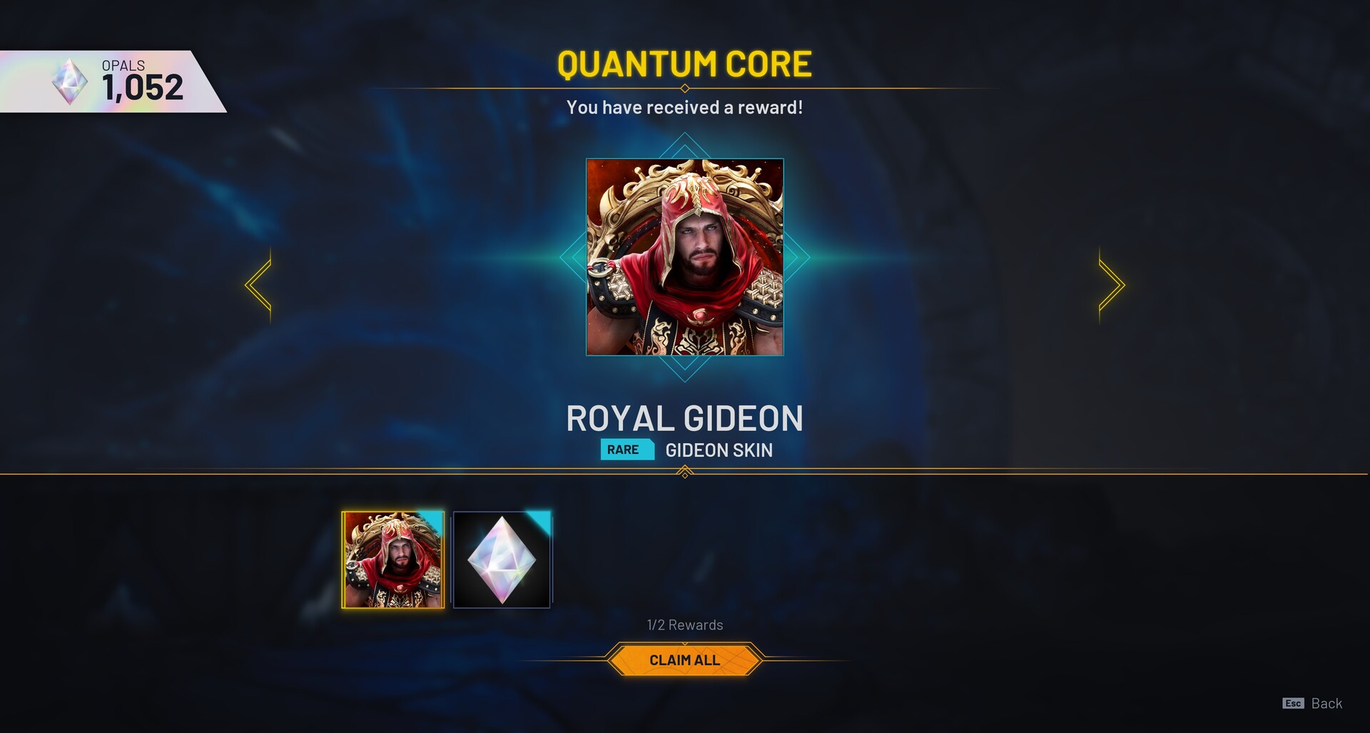
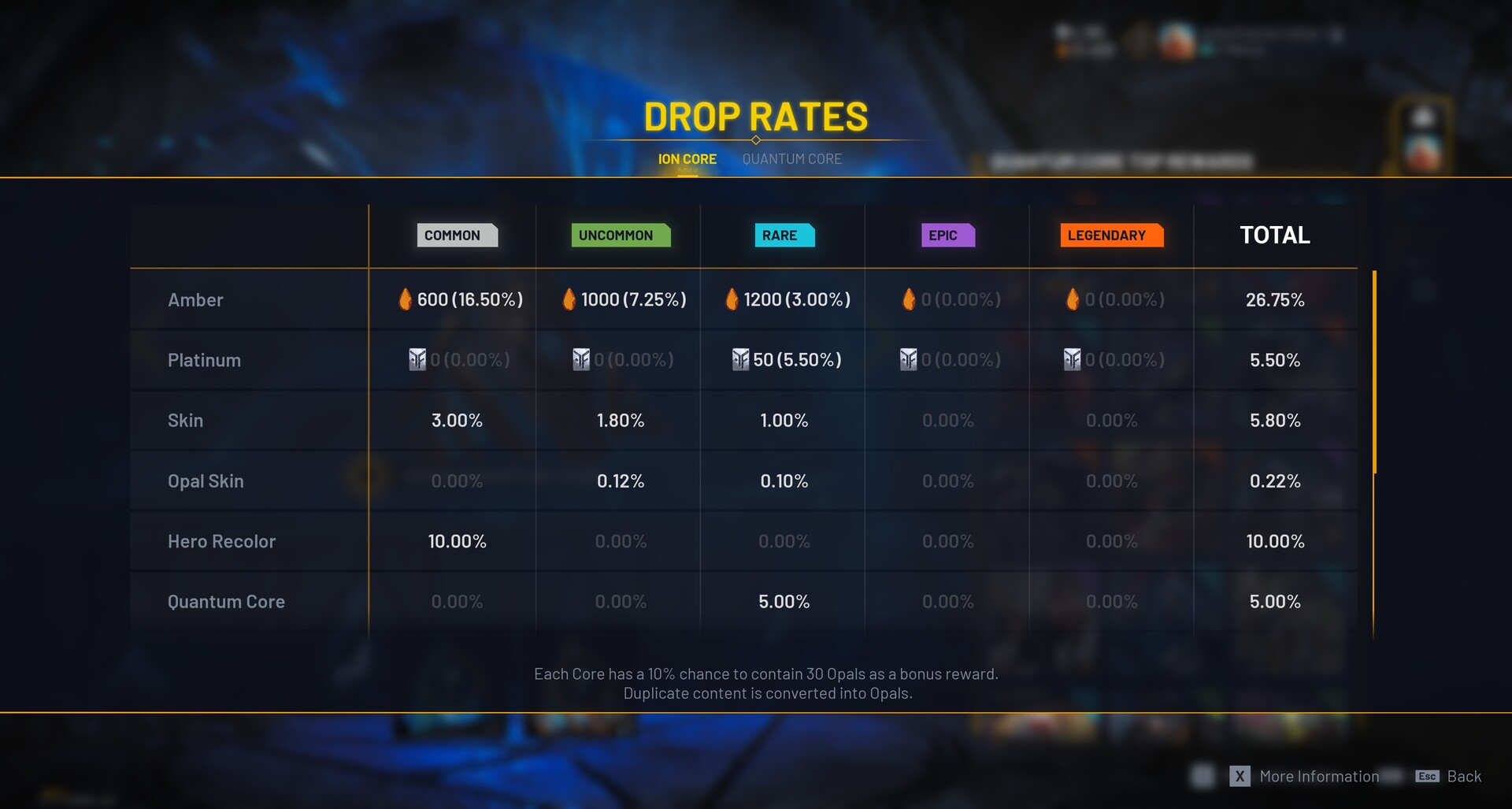
Loot Cores
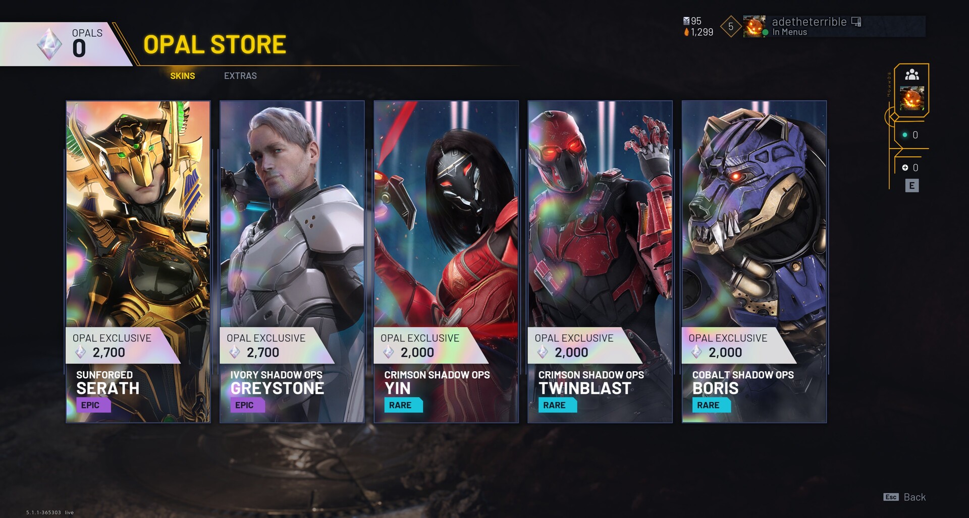
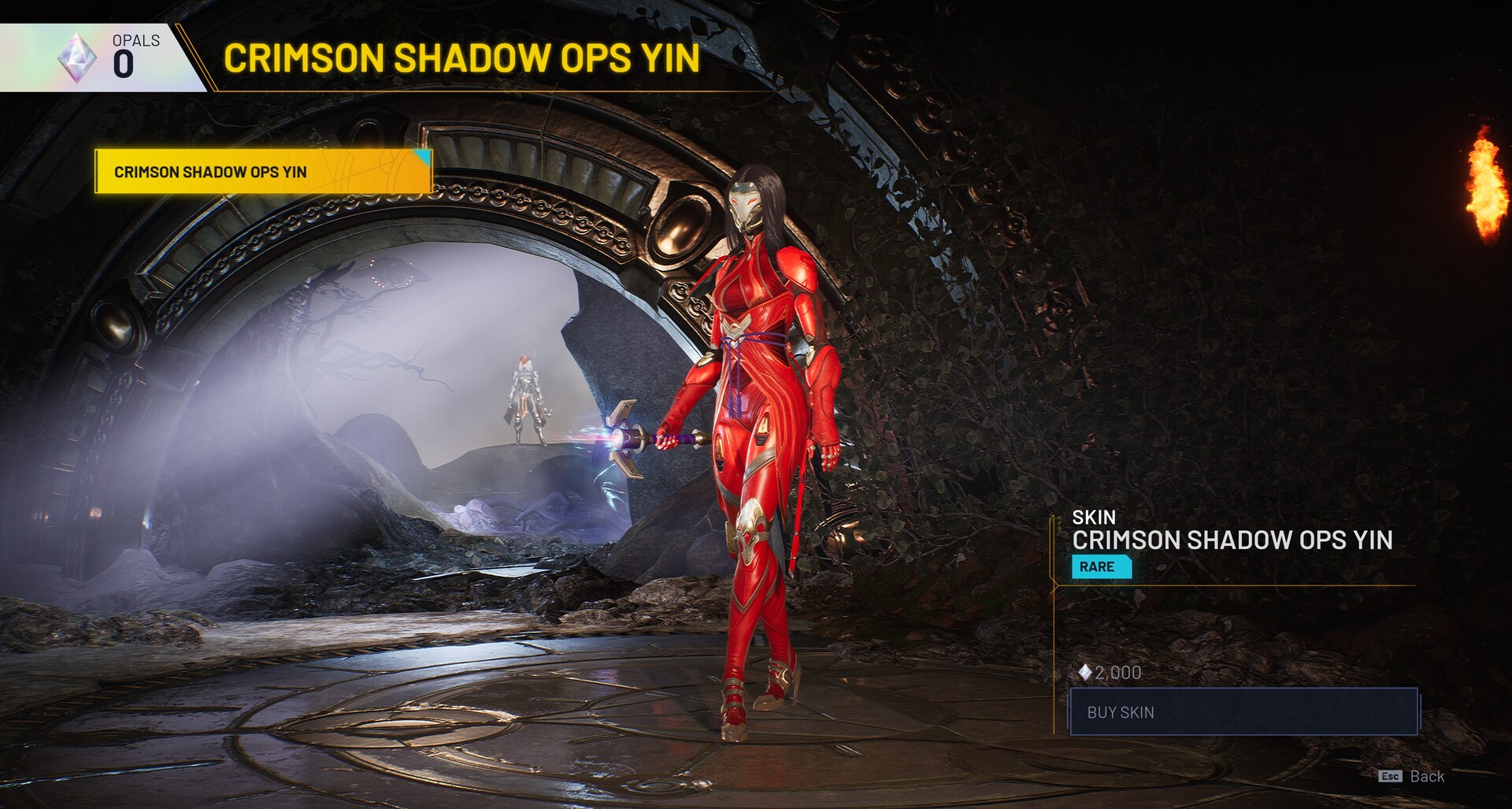
Predecessors Loot Core feature was a key focus for the business during this time – as the goal was to offer more ways for players to earn rewards, and increase player retention. Predecessor’s origins as a spirirtual successor to Epic’s Paragon was also key to this goal, as Paragon had featured a well regarded Lootbox system, which players were keen to see return in Omeda’s game. With Lootboxes continuing to be a controversial subject within the gaming landscape, my primary objective was to deliver the Loot Core feature in a way that adhered to the strict legal requirements around Lootboxes, whilst also offering great player satisfaction and safeguarding players from potentially harmful UX patterns.
Collaborating with Omeda’s Principal Game Designer Alex Felton, we were able to deliver a highly polished and thoughtful design for this feature. With satisfying opening animations, UI widgets which leveraged the visual treatment of cosmetics game wide, and the addition of an elegant “Opal Store” UI where players can spend currency earned from duplicate drops, the loot box feature was a major success for player retention and has garnered praise from Predecessor players.

Kill Notifications
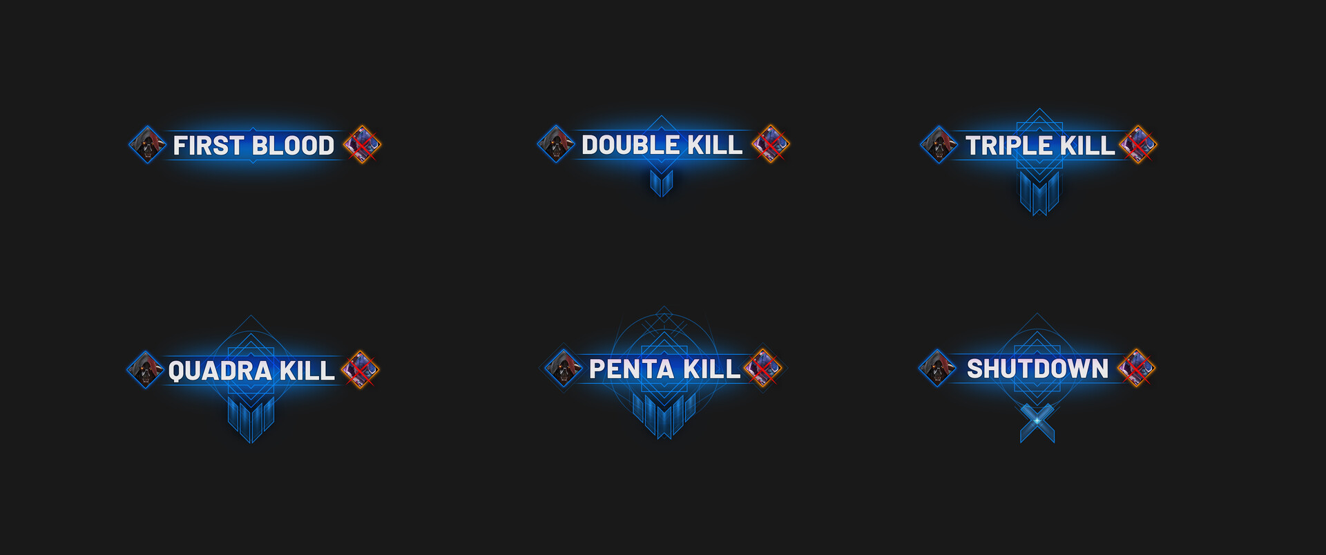
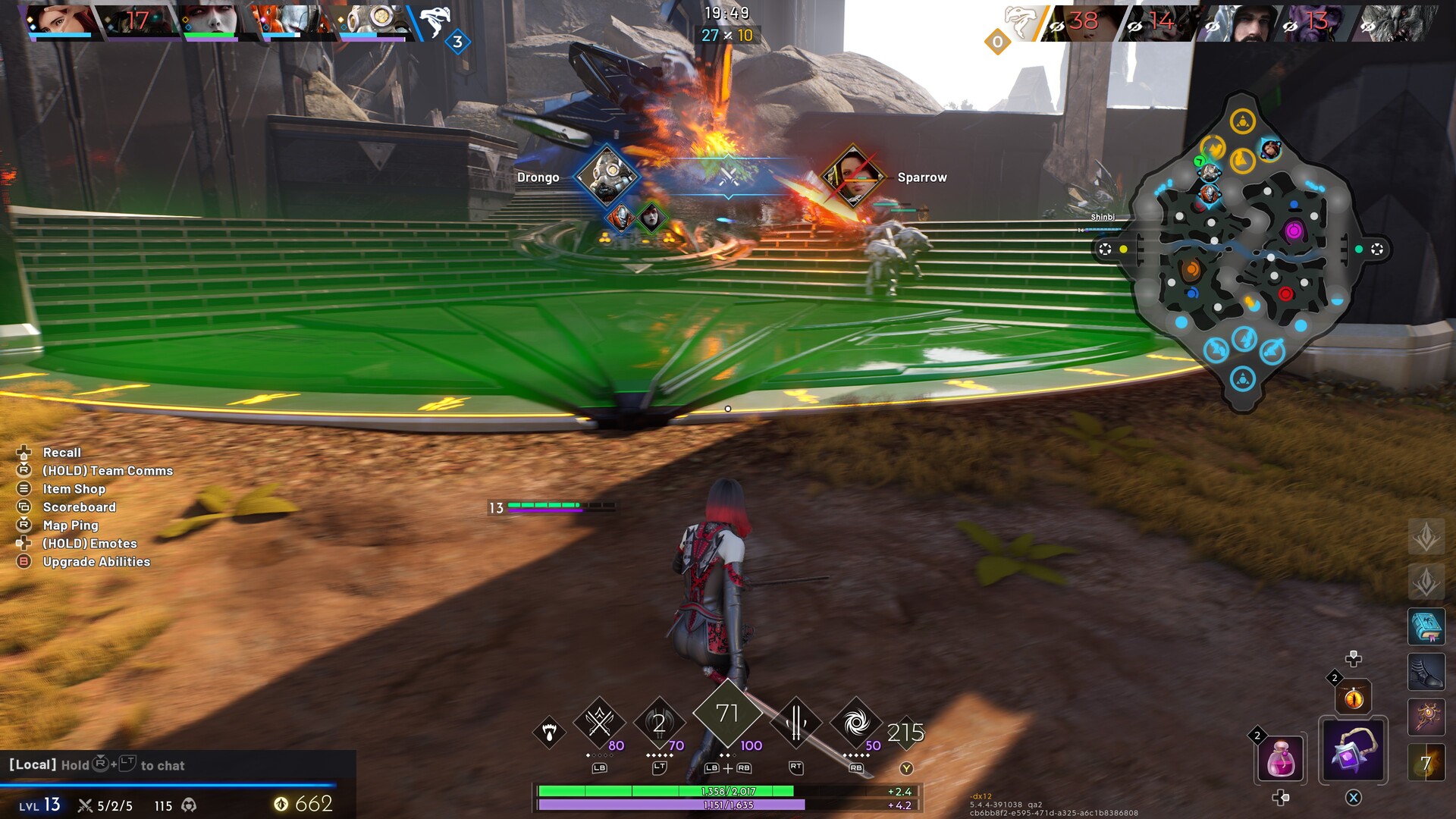

One of the major pieces of feedback Omeda had received about Predecessor was that the kill notifications lacked impact and polish. As part of a strike team working under CEO Robbie Singh, I was tasked with re-designing these notifications, adding additional animation flair and weight to them. Taking inspiration from competitor games such as League Of Legends and Marvel Rivals, I added a sense of progression to the widget, adding more ornate and intricate designs to the widget as the number of kills increases. Not only did I provide the mockups and UX design for this improvement, but I also single handedly implemented the new improvements and animations for the widget in engine – taking the feature from concept to final.
Hero Icons
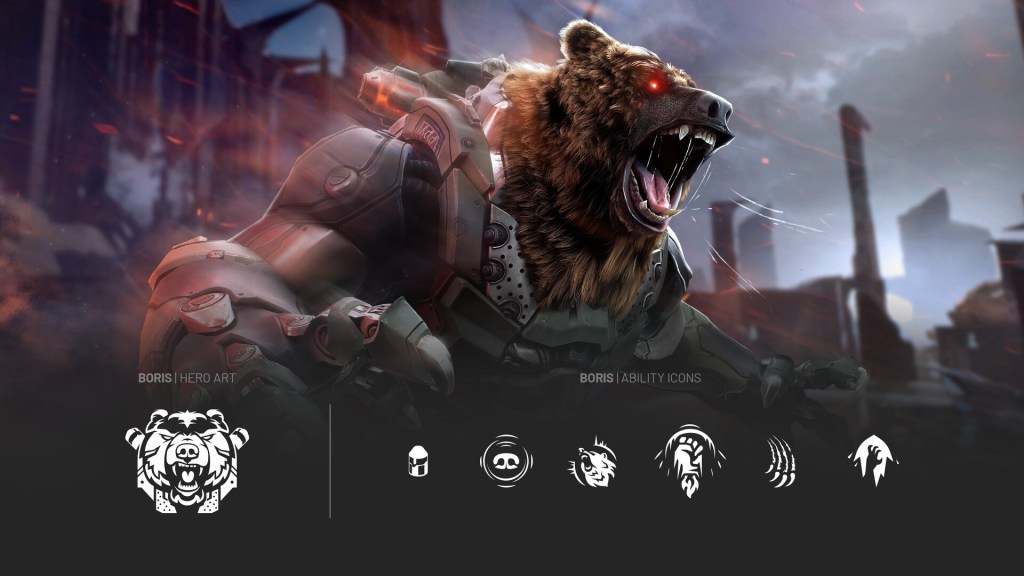
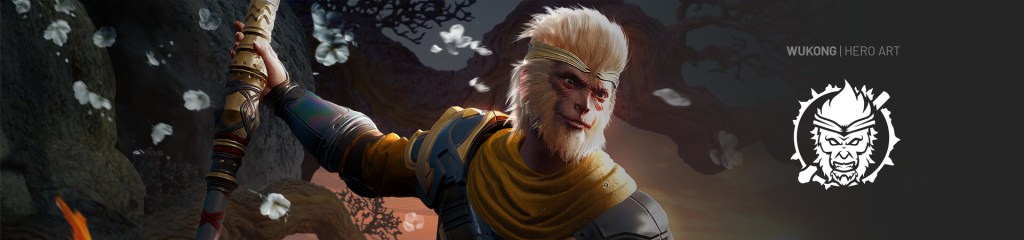
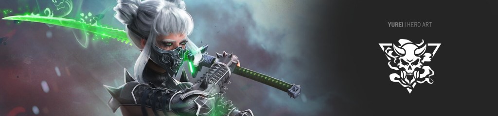
As a live service, hero based game, Predecessor has a wide roster of characters available to players, with the cast growing with every update. When I joined the team, they were at a crucial juncture, as they moved from shipping previously well known Paragon heroes like Boris and Wukong, to creating brand new characters that fit into the future narrative of Predecessor, starting with Yurei. It was important to set a tone and consistency with the hero icons for these characters, so that Omeda’s new characters built in-house felt like they belonged with the Paragon heroes.
Adhering to Omeda’s well established icon style, I was able to create emblems which alludes to the character and backstory of each hero, as well as visual motifs that were fundamental to their 3D design. This set a firm foundation and benchmark for all heroes that followed.
