Criterion / 2021 – 2023
I joined development on NFS Unbound in 2021, at first working alongside Electric Square, working with Studio Art Director Jay Green, and UI Artists Samad Iqbal and Jack Hooker, to support co-development efforts. Midway through development, I was brought onto the Criterion team fully to work with Lead UI Artist Dan Pratt, my fellow Senior UI Artist Sailesh Vaghela, and Art Director Mike Cornwell, to finish development and aid the team with Live Service. My contribution was critical to the UI Art Style on the game, focussing on the game’s Front End screens, including the event intro and outro screens. I also was in charge of the UI for the map, including icon shape and colour, road network, balancing the terrain with UI communication, cursor behaviour and highlight states.
The brand refresh for Need For Speed that was utilised for this game went on to win a Clio Gold Award, with the UI that we designed being part of the submission.
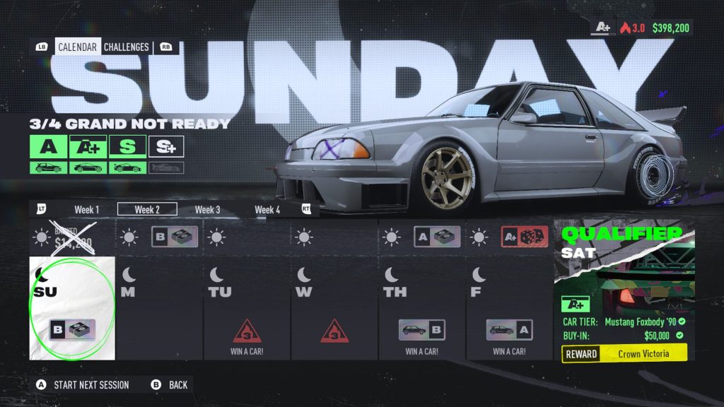
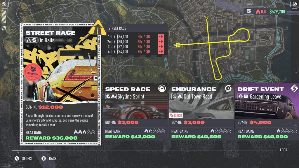
Map

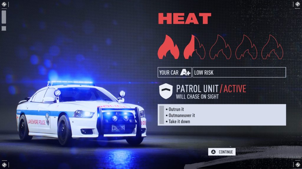
The map screen in NFS Unbound was a unique challenge compared to every other Front End screen in the game. In traditional open world games, especially racing games, players use the map to just figure out where they want to go next. In NFS Unbound, the team at Criterion saw the map as a major strategic planning tool for the campaign. The game’s single player progression revolves heavily around earning and banking cash to progress through the story’s chapters whilst avoiding too much heat from cops: with that in mind, the map had to balance navigation needs, with delivering lots of information on opportunities for the player to make money, whilst also letting know the risks involved.
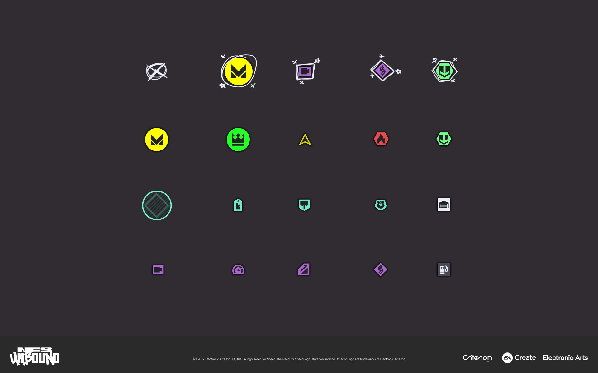
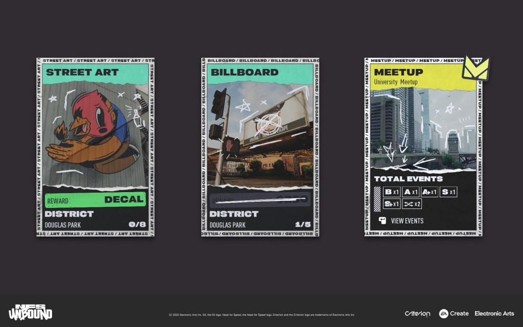
Stripping this problem down to it’s core, I worked alongside UX designers Dave Campbell and Laurence Bowen to prototype sizing, colour and iconography for race events – instinctively knowing that for a screen as busy as this, simplicity would be key. Following the streetwear influence of the game’s UI style, I was able to craft a library of clear, bold icons, which leveraged shape language and the game’s mature colour, limited palette to streamline communication and point out beneficial opportunities.
With this firm foundation in place, we could expand the rest of the map UI. First came the map background, put in place by Concept Artists Josh Atack and James Lewis-Vines, closely followed by the road network – with road network details such as tunnels, dirt roads and highways hand painted by myself to aid user navigation. As the icons found their way in game, we could balance the information surrounding them to provide good visibility, and continue to iterate until we had a sweet spot the team were happy with. Finally, the core functionality of the map was capped out with a hand drawn cursor, which reacted dynamically to selection states by changing shape to match the icon that was in focus. This illicit touch of polish factored into the “deface the base” ruleset that guided our UI Art pinciples: create a clean foundation for the UI, and then deface it to elevate the visual quality.
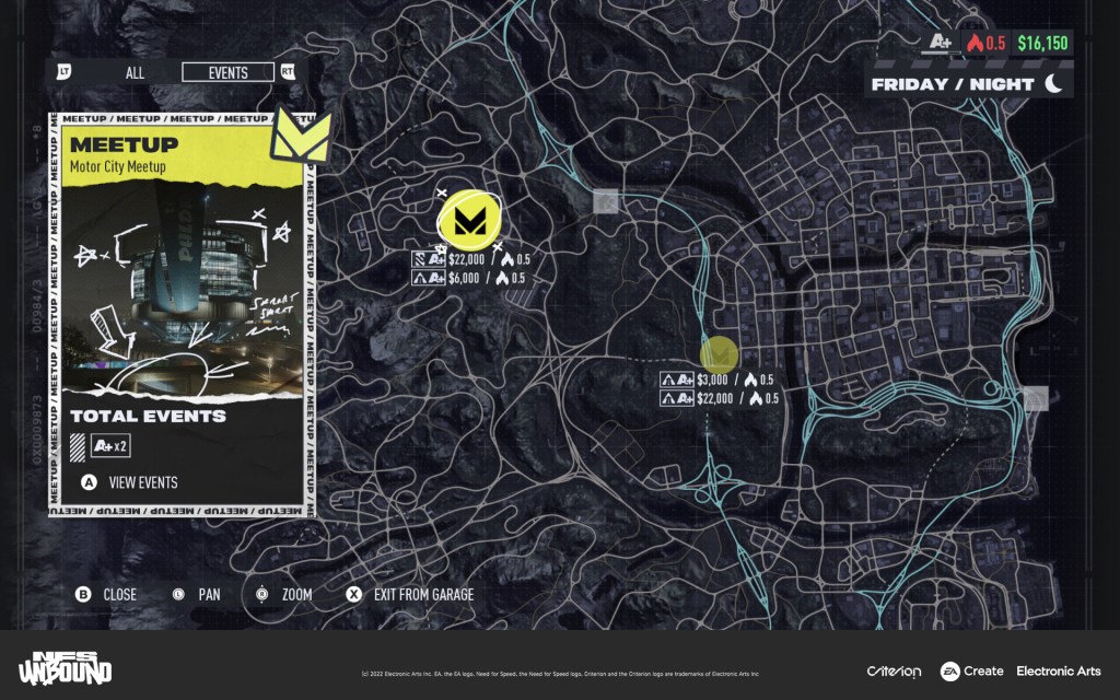
The final touches to the map were the visual treatment used during night time, and the information panels that accompanied the player’s selection. It was important that NFS Unbound’s map reflected the time of day, giving players an instant indicator of how gameplay during their current session will be impacted. Cop activity is increased at night, and the pressure of gameplay is at it’s highest, so the map had to reflect this – utilising a CCTV style overlay, adding an oppressive and claustrophobic atmosphere to the screen. The information panels, on the other hand, were there to take some of the heavy lifting from the map icons. Players could gain further information about a map icon and the activities available at a given location by viewing these panels.
Speed Pass

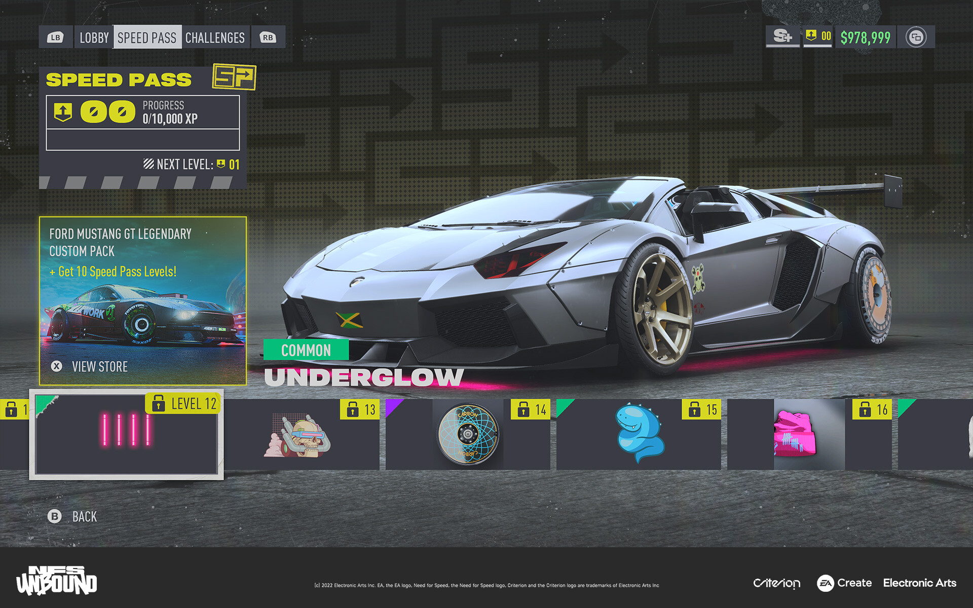
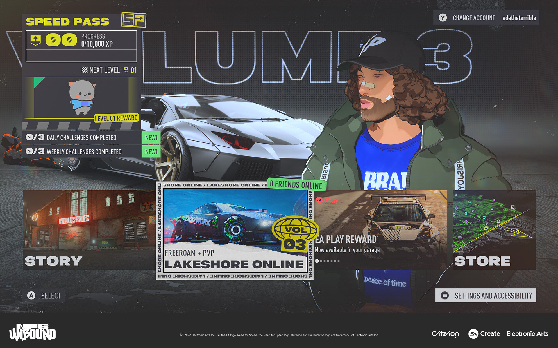
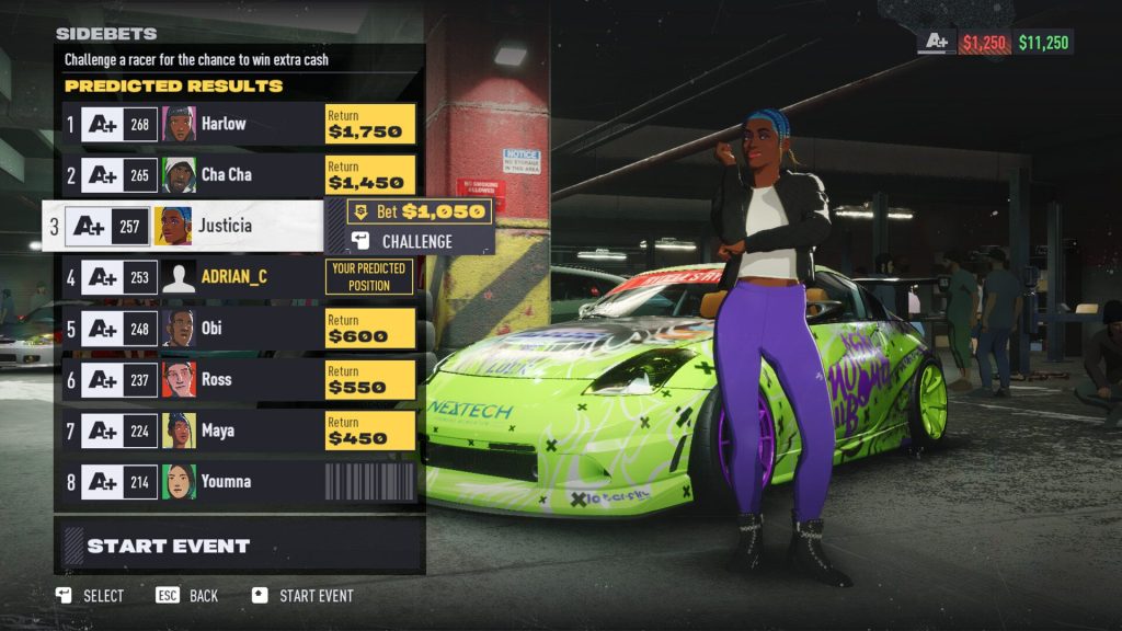
The Speed Pass, NFS Unbound’s answer to the well established “Battle Pass” game mode, often seen in third and first person shooters, was designed by myself and UX Designer Kate Parr. One of the core parts that the Speed Pass needed to get right, was to feel like a major feature in the game, and the best way to do that was to establish a brand for it. This included unique iconography, a hero colour, and unique supporting patterns for use in areas of the UI. By locking down these elements, and filtering them into the UI throughout the Multiplayer experience, players instantly understood when they were contributing towards Speed Pass progress.
