Playground Games / 2016 – 2021
On Forza Horizon 4, I worked with Playground Games’ UI Art team, collaborating on the UI Style and UX for the project. I also steered the concept and implementation of UI & UX for live content post release on Forza Horizon 4, adapting to working on a game which operated as a service and ensuring new features shipped at high quality. In particular my 3 biggest contributions to the game where the Festival Playlist, Super7, and Horizon Backstage.
Festival Playlist
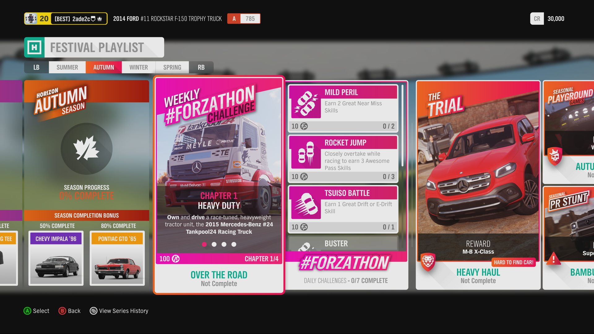
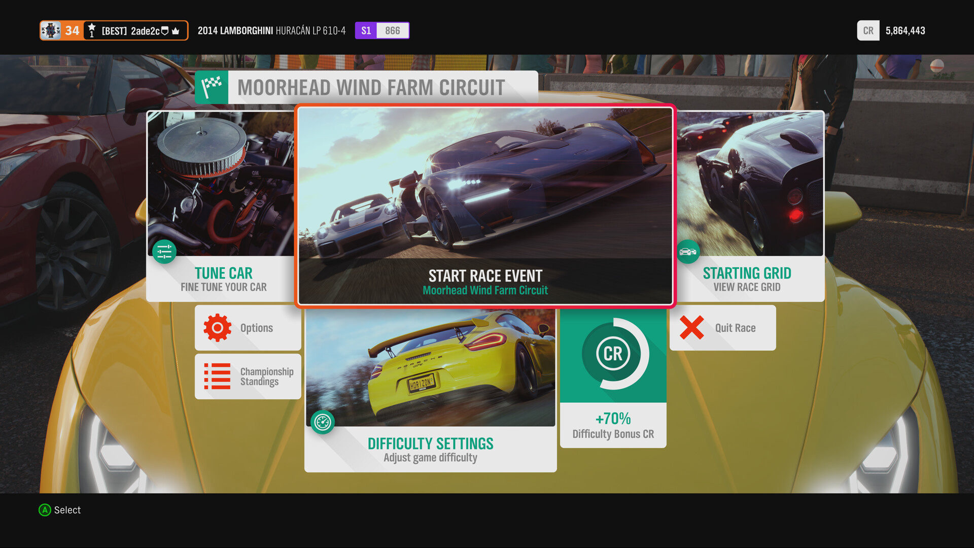
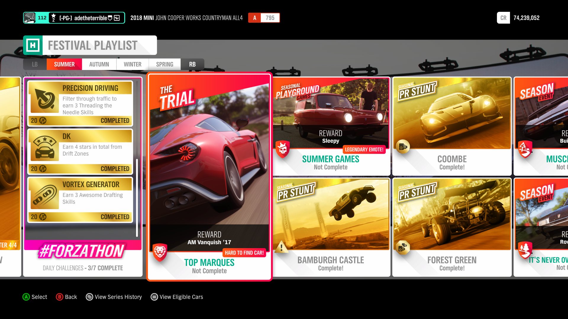
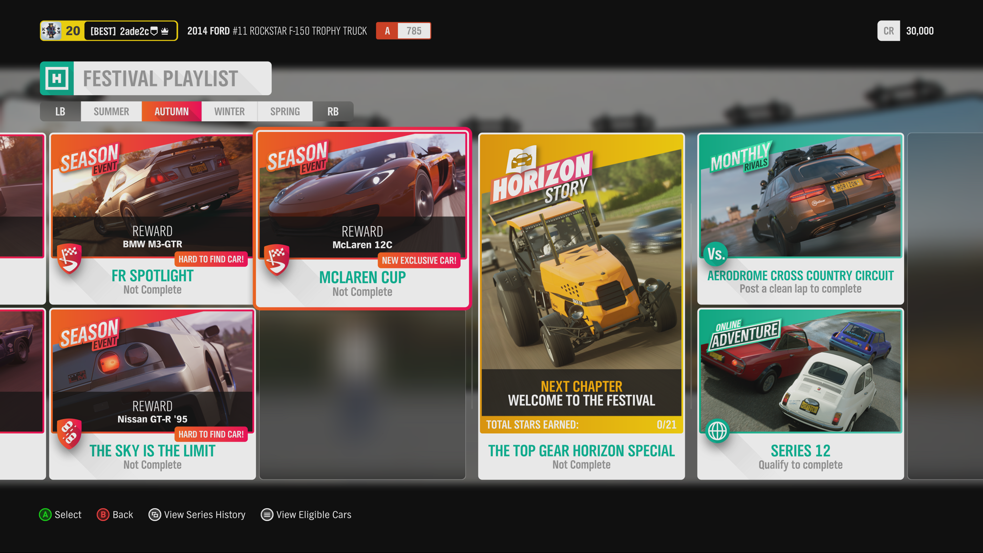
The Festival Playlist was designed to be the driving force for players during the game’s live service: a constantly revolving series of events and challenges, updated weekly, to bring players back for new rewards and gameplay. Two things were incredibly important for this feature: showcasing a wealth of content, and offering a deep feeling of satisfaction upon completion. One of the areas I had contributed to the most on the Forza Horizon franchise was establishing a unique, consistent voice for in-game imagery within our UI (and eventually in social media assets for the game), and we leveraged this here to communicate core information via images. With a single, well composited image, we could show off:
- The reward players will win
- The type of vehicle players will be expected to use for the challenge
- The weather conditions the event takes place in
- Specific gameplay the player may be required to engage in
We often balanced many aspects of a given Festival Playlist challenge this way, and the confidence that the Game Design team had in my skills meant we could often us “a good image” to reduce the amount of information required on the tiles for this feature. Even still, the brief for the Festival Playlist called for a large quantity of core details per challenge, which we iterated on to build the eventual shipped feature. The Live Service nature of Forza Horizon 4 meant that we could also gauge player sentiment for the feature, and improve over time, and into future games. In that regard, Forza Horizon 4’s Festival Playlist was a strong foundation for the franchise to build upon, and it’s success became clear when players returned week after week to complete new Playlist challenges.
Super 7
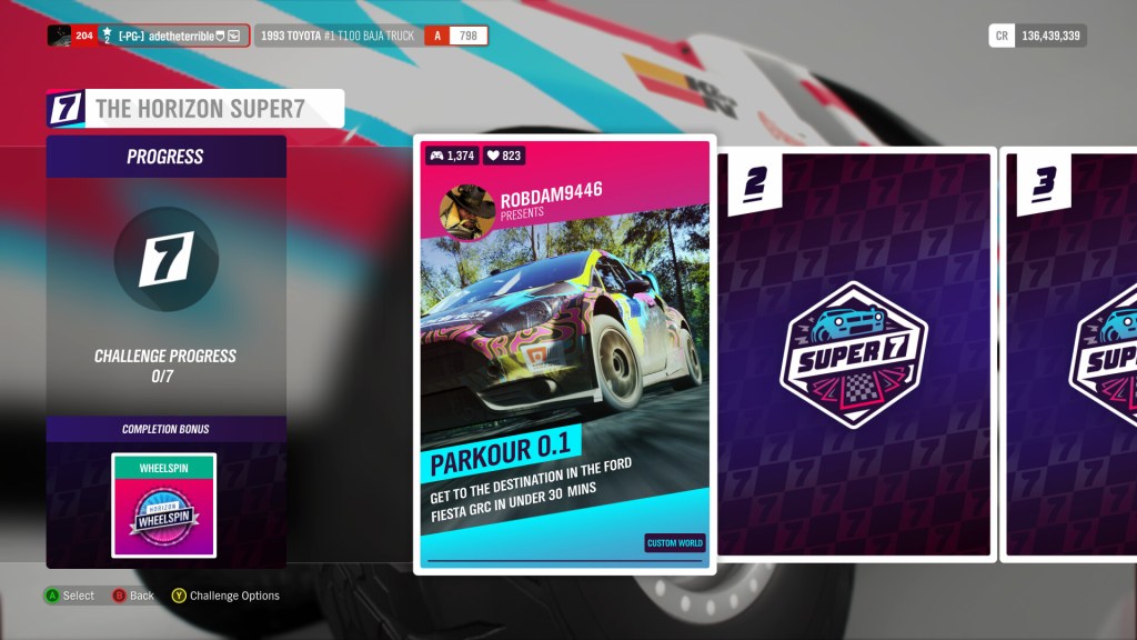
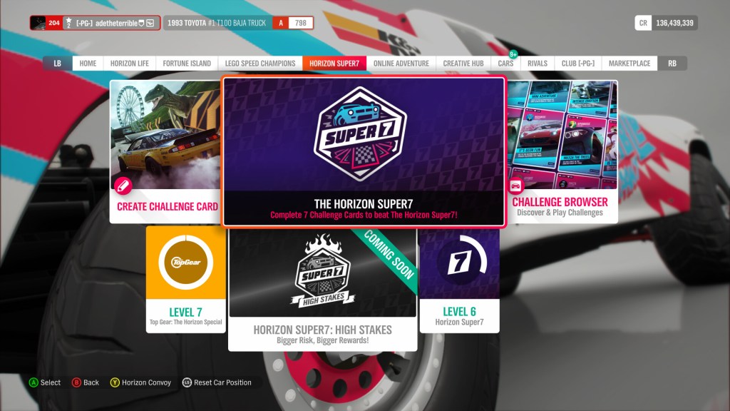
The Horizon Super7 was considered the last “major” feature for Forza Horizon 4 – comparable to an full DLC expansion. The core idea was to leverage UGC content, and random gameplay mechanics, to create an endlessly replayable game mode where drivers bet on their skills to complete 7 player created challenges. I was responsible for the full visual presentation of the feature: including graphic design for the feature branding, UI design, and images used to market the feature.
My core inspiration for the visual style of this feature were playing cards. The Horizon series always leans into the use of physical, printed media to inform it’s UI (from Forza Horizon 1’s Event Tickets and Wristbands, to the use of Event Posters in the later games, the theme park style Mexico map from Forza Horizon 5’s campaign, and even treasure maps and photos from the Fortune Island expansion in Forza Horizon 4), so playing cards was a natural extension to this that felt at home. I spent a lot of time looking at playing cards, and cards used in other popular board games such as Monopoly and Uno to get a feel for the graphic design elements used in this medium, including spacing, font size and materials. This helped me create a visual that felt wholly unique within the game.
For the wider feature brand, this was heavily informed and inspired by social media and sharing platforms like Twitch, Youtube and Tiktok. TikTok especially was a huge inspiration for the feature’s small form logo and colour palette. The feature logo was designed to not only be a striking visual identifier alone, but also to offer a unique shape that stood out in the game’s many UI areas. As with many features in Forza Horizon, The Super7 had a physical start location on the game’s map, so the logo had to have a unique shape to stand proud in the existing map icon language.
Horizon Backstage
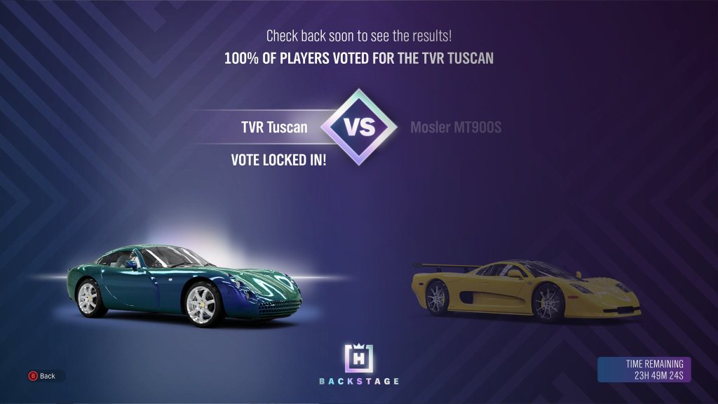
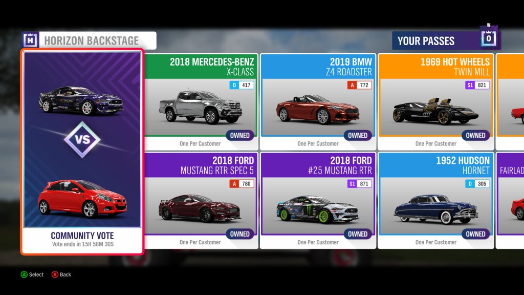
The final feature I worked on for Forza Horizon 4 was the Horizon Backstage. By the time the Horizon Backstage first appeared, the game had been live for 2 and a half years, and many of the game’s rarest cars were nearly impossible to earn. Backstage gave players a chance to win “Backstage Passes” – which plugged into the game’s existing challenge system as a reward – to be spent on these rare vehicles.
My role on the feature was to design the feature branding, the store UI, and the “voting” UI: a weekly player vote screen where the community would collectively decide which rare car should be added to the Backstage store next. Designing the branding for the Horizon Backstage presented a problem. Forza Horizon’s general UI language reserves rare metals such as Bronze, Silver and Gold for gauging your completion of events, but the Backstage feature required a feeling of precious exclusivity that Gold tends to signify. After some extensive research into luxury brands such as Gucci, Prada, Louis Vitton and Cartier, I tried an alternate approach.
Alluding to rare gems, and an additional level of quality on top of metals such as Gold or Platinum, I opted for the use of iridescent materials within the feature branding. Topping this all off was a tactile, quietly confident repeating square pattern, building on and expanding the Horizon Festival logo. The festival logo, originally designed by Principal UI Artist Richard Evans, was already elegant and bold in it’s presentation, making it a great foundation for the direction the Backstage brand required. By adding a simple ground to the logo, and a dazzling iridescent sheen, we were able to take the Horizon Festival, and create a sub-brand which felt special for long time playters, and oozed exclusivity.
